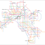
Railway history map
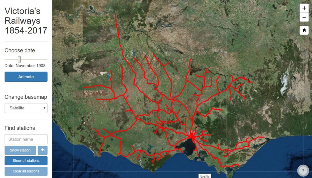
The expansion - and, sadly, the subsequent contraction - of the railway system in Victoria
Where can I go?
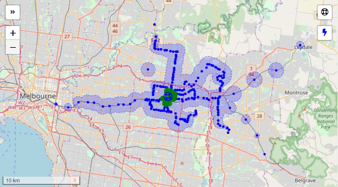
How far can I go by public transport in Melbourne in 45 minutes, if I set off now?
Melbourne native trees
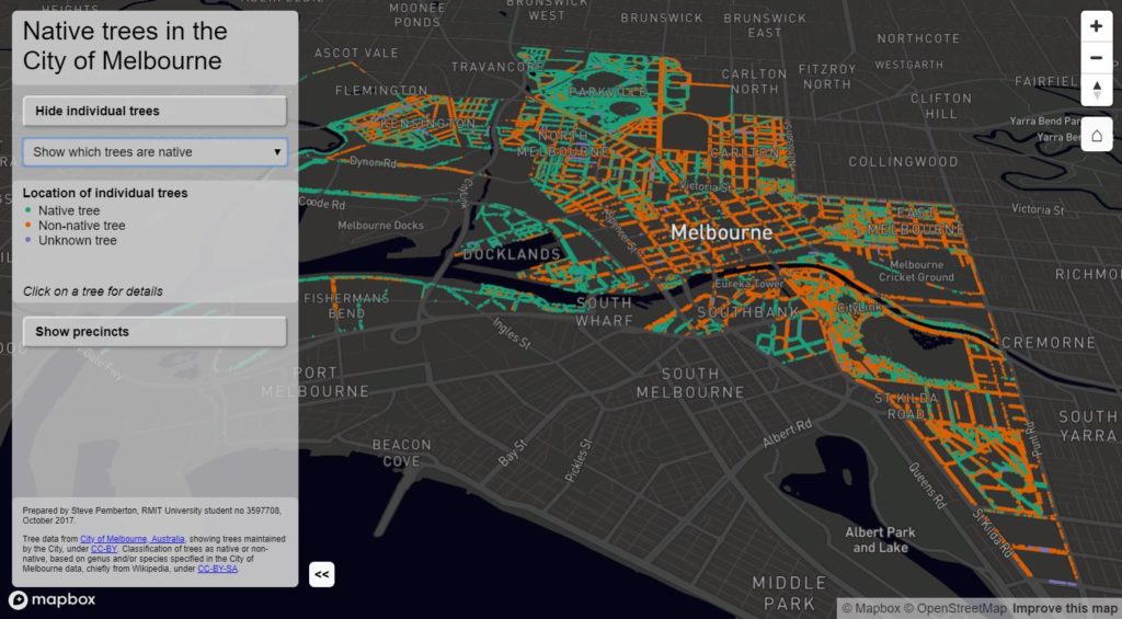
Where are the native trees in the City of Melbourne? And why aren't there more of them?
Animated public transport
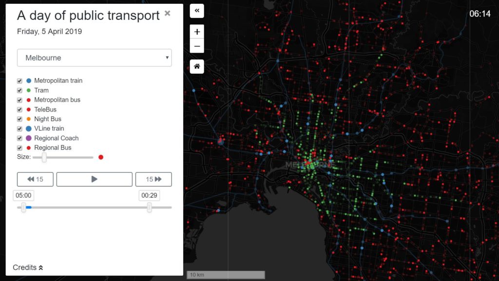
A day in the life of Melbourne's public transport. OK, it's essentially a toy (and needs good connection speed to work well), but I think it's fun.
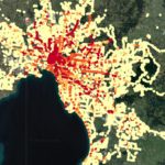
Melbourne’s transport-rich and transport-poor areas
Inspired by Daniel Bowen’s review of service levels at Melbourne’s rail stations, I wanted to compare numbers of train, tram and bus departures across Melbourne as a whole. This map draws on Public Transport Victoria’s timetables in GTFS format, showing total number of train, tram and bus departures on a representative weekday (17 April 2019). […]
Improving Melbourne’s bus routes
Completed the final project for my Masters degree in GIS at RMIT University last year, investigating whether we would get better public transport outcomes if we reconfigured our bus routes into a network of sparser but more direct and frequent services in an intersecting grid. Found that if we moved from this (showing current bus […]
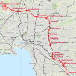
Why Melbourne needs an Airport Crosslink Rail
I did this a few years ago, before construction of the Metro Tunnel had started, and maybe it’s now been superseded by the Suburban Rail Loop proposal. But I still like it. See my interactive Esri story map for more details.
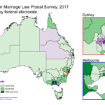
Australian marriage equality
How each federal electorate voted in the marriage equality survey. Map made with QGIS.
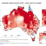
Swings in the Australian 2016 federal election
Mapping anything to do with Australian federal elections is a problem because of the disparity in electorate sizes. Some individual electorates are larger than some whole states. I made this map a while ago, to show the swings (on a two-party preferred basis) in the 2016 federal election. This was the election where the Liberal/National […]
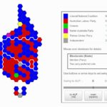
A hexagon cartogram for the Australian 2016 election
Hexagon cartograms are often used for UK election results, but I haven’t seen them much in Australia. I wanted to try creating one. And I’ve added swing controls so you can model a swing to the ALP or the Coalition and watch the seats change hands. Mouse over electorate for details: Electorate (State) Member (Party) […]